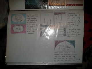
I think I am going to design a leaflet for my third element because it is a simple and effective way to widely spread information that is not overly costly. These are a few pages/images of the leaflet designs.
Showing posts with label Graphic Communication Principles. Show all posts
Showing posts with label Graphic Communication Principles. Show all posts
Friday, 4 May 2012
Thursday, 26 April 2012
Exhibition Boards
These are some of the designs I did based on the possible idea of having an exhibition board as the third element. I've never done anything like it before so don't think I will carry on with it but it was fun to at least play around with.
Friday, 13 April 2012
3rd Element
No idea what to do for the third element so a brain storm is always a nice way to start the ideas flowing! As it happens not that many ideas came to mind but it felt like the whole third section was a bit rushed because we had a lot less time to work on it then on the posters so having fewer ideas made it easier to deal with.
I thought about doing an exhibition stand, a selection of stationary, a game or a leaflet. I need to make sure that which ever I choose is relevant to my campaign and that it will enhance it in the long run.
Wednesday, 11 April 2012
Final Poster Designs!
These are going to be my final posters because I have already spent way too much time on them and they will never be quite what I want but these are the results I have achieved in the time allowed. I still think they are missing something and that they need developing further but I have to move on to the third element so this is the poster conclusion. Hopefully you can tell which one is for the event and which one is the general poster!
Wednesday, 4 April 2012
Final poster designs
These are the final thumbnail designs I did before I started to design my final posters. I decided to experiment with using actual images in the posters because previously I didn't want to but thought I would have to to give them what was missing.
These are the posters designed from those thumbnails
Monday, 26 March 2012
Thumbnails of poster development
These are just a few images of how my posters ideas are developing, they're all fairly rough for the moment but they get across the kind of idea I hope to portray. The posters need to be colourful and exciting to interest the audience which is why they're quite over crowded, hopefully they'll look better to scale at A2.
Tuesday, 20 March 2012
futher posters after group crit
These are some of the poster designs that I did in colour by hand, I've kept them in keeping with my colour palette so that they would match with the rest of my brand. I experimented with the layouts and shades of colour as well as textures to see what I liked. Most of the posters I've done are A4 but two of them have been done on A3, these include more detail about the event and campaign.
Sunday, 18 March 2012
Poster designs following group crit session
After the session I decided to go a bit more adventurous with my poster designs because the original ones were truly shocking! I got the idea for these from Jen :) who suggested I did something along these lines, and I think they have worked out alright. These were done by hand because I think that it would make for a more effective poster than it being computer generated, also it may defeat the point slightly. I will add colour to these but to begin with just decided to design them in fine liner and see what they would look like, I did them on A4 so they would have to be scaled up to size.
Friday, 2 March 2012
Initial Poster Designs
These initial drawings for my posters are very basic and were done rather spur of the moment, just the first idea that popped into my head, so they're not very well formed or particularly successful but they are my original starting point. They were focused on the idea of letters being sent or travelling from one person to another.
Friday, 24 February 2012
Brand Palette
I went through a lot of development and experimenting before I settled on my palette. I wanted it to look fun and colourful so that it would be inviting for the audience and encourage them to take an interest in the campaign. I went for quite a simple name style, just the name handwritten in a slightly scripted fashion and the basic envelope as the logo. I decided that the logo could come in a range of shades, depending on where it was being used and what it would suit most.
Thursday, 2 February 2012
500 Word Proposal (or slightly over)
I originally hand wrote my proposal because it seemed strange to word process my 'campaign' when it was trying to promote the benefits of handwriting over typing/texting, but decided for convenience it would be easier to upload this version, there are still some areas that need work and I've already made a few changes since writing this but this is the basic idea i'm going for. Be proud of your own 'personal font' :)
Subscribe to:
Posts (Atom)


.jpg)