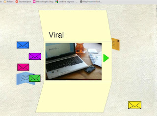
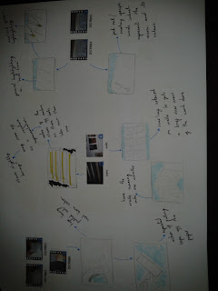
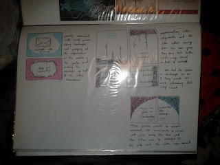
I think I am going to design a leaflet for my third element because it is a simple and effective way to widely spread information that is not overly costly. These are a few pages/images of the leaflet designs.
Friday, 4 May 2012
Thursday, 26 April 2012
Exhibition Boards
These are some of the designs I did based on the possible idea of having an exhibition board as the third element. I've never done anything like it before so don't think I will carry on with it but it was fun to at least play around with.
Wednesday, 25 April 2012
Night before branding viral hand in...
Just realized that I took out the section in my viral which included the course title because I was going to re-do it and then forgot to put it back in! So unfortunately that will be missing from my viral ...
Finishing touches to the Branding Viral
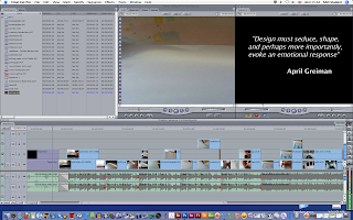
To finish the viral I added in the quote at the beginning and decided to put some general static noise behind the text so that it wasn't completely silent. I put the quote first in the hope that my viral would reflect the message behind the quote. To end the viral I included the university logo to remind the viewer where the viral had come from.

Branding Viral Soundtrack
I went through a few possible songs for the viral soundtrack before I settled. I played around with the idea of using generic background music but decided that I wanted to use a song which I was familiar with so then I could picture it fitting with the viral. In future I plan to pick the soundtrack early on so that I don't have to try and make the footage fit to the song because I think it would have been easier doing it the other way round.
I edited the song 'super massive black hole by Muse' in garage band so that the opening instrumental was longer and I could fit in most of my footage before the vocals start, however when it came to load it into final cut it wouldn't accept the file type.
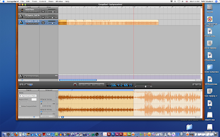
So instead of trying to use the edited track I imported the original version of the song into final cut and then edited it in, using the sound waves on the sound layer.
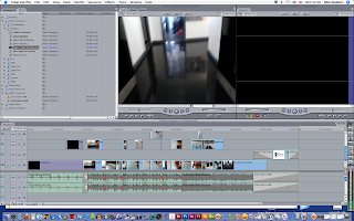
I edited the song 'super massive black hole by Muse' in garage band so that the opening instrumental was longer and I could fit in most of my footage before the vocals start, however when it came to load it into final cut it wouldn't accept the file type.

So instead of trying to use the edited track I imported the original version of the song into final cut and then edited it in, using the sound waves on the sound layer.

Thursday, 19 April 2012
Final Cut
Over the past few weeks I have been compiling my video footage into Final Cut, I have never used this software before and can't say that i'm overly fond of it. Like most software it gets easier to use when you use it more often but there are things about it which make it slightly frustrating, like having to wait for things to render but I suppose you would get that with any kind of video editing software.
I wanted to show how some of the effects had worked out and what it made the footage look like when they were overlaid. I think that the opaque effect works really well with the video and the message I was trying to get across with in the viral.
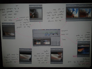
I wanted to show how some of the effects had worked out and what it made the footage look like when they were overlaid. I think that the opaque effect works really well with the video and the message I was trying to get across with in the viral.

Saturday, 14 April 2012
Song for viral
This is the song that I putting my viral video to. I picked this song because its fun to listen to and has a very definitive beat which I works well with my viral because its stop motion. The song still has the vocals on it because I don't know how to either edit them out or find a version without! But its a good song either way :)
Friday, 13 April 2012
3rd Element
No idea what to do for the third element so a brain storm is always a nice way to start the ideas flowing! As it happens not that many ideas came to mind but it felt like the whole third section was a bit rushed because we had a lot less time to work on it then on the posters so having fewer ideas made it easier to deal with.
I thought about doing an exhibition stand, a selection of stationary, a game or a leaflet. I need to make sure that which ever I choose is relevant to my campaign and that it will enhance it in the long run.
Wednesday, 11 April 2012
Final Poster Designs!
These are going to be my final posters because I have already spent way too much time on them and they will never be quite what I want but these are the results I have achieved in the time allowed. I still think they are missing something and that they need developing further but I have to move on to the third element so this is the poster conclusion. Hopefully you can tell which one is for the event and which one is the general poster!
Friday, 6 April 2012
Microsite 2 - revamped!
So I adjusted my original microsite because it was a bit over the top with the majority of things, I went too far on trying to make it entertaining and it just became distracting. These are print screens of my new microsite design, I created another palette to work with as well which was more consistent with things.
Wednesday, 4 April 2012
Final poster designs
These are the final thumbnail designs I did before I started to design my final posters. I decided to experiment with using actual images in the posters because previously I didn't want to but thought I would have to to give them what was missing.
These are the posters designed from those thumbnails
Monday, 2 April 2012
Quote Research for Viral
As part of the branding viral we have to include an inspirational quote, along with the course title and university/logo. I have been looking at a few quotes concerning graphic design which I personally find quite interesting and inspiring.
Brian Reed - Everything is designed. Few things are designed well.
Robin Mathew - Design is where science and art break even.
Brian Reed - Everything is designed. Few things are designed well.
Robin Mathew - Design is where science and art break even.
Steve Jobs - Design is the fundamental soul of a human-made creation that ends up expressing itself in successive outer layers of the product or service.
Milton Glaser - Computers are to design as microwaves are to cooking.
April Greiman - Design must seduce, shape and perhaps more importantly, evoke an emotional response.
David Carson - Graphic design will save the world right after rock and roll does.
Orson Welles - Create your own visual style ... let it be unique for yourself and yet identifiable for others.
Just a few which i'm considering!
Wednesday, 28 March 2012
Footage/Sketches
Monday, 26 March 2012
Thumbnails of poster development
These are just a few images of how my posters ideas are developing, they're all fairly rough for the moment but they get across the kind of idea I hope to portray. The posters need to be colourful and exciting to interest the audience which is why they're quite over crowded, hopefully they'll look better to scale at A2.
Thursday, 22 March 2012
Viral Story Boards
These are the initial story boards that I was trying out after doing my research, photographs and sketches. There isn't really anything concrete to them but they allowed me to get some of my ideas down on paper.

This is the storyboard which I am going to base my main viral on, depending on how it works out with the amount of footage I can fit into the video.


This is the storyboard which I am going to base my main viral on, depending on how it works out with the amount of footage I can fit into the video.

Tuesday, 20 March 2012
futher posters after group crit
These are some of the poster designs that I did in colour by hand, I've kept them in keeping with my colour palette so that they would match with the rest of my brand. I experimented with the layouts and shades of colour as well as textures to see what I liked. Most of the posters I've done are A4 but two of them have been done on A3, these include more detail about the event and campaign.
Sunday, 18 March 2012
Poster designs following group crit session
After the session I decided to go a bit more adventurous with my poster designs because the original ones were truly shocking! I got the idea for these from Jen :) who suggested I did something along these lines, and I think they have worked out alright. These were done by hand because I think that it would make for a more effective poster than it being computer generated, also it may defeat the point slightly. I will add colour to these but to begin with just decided to design them in fine liner and see what they would look like, I did them on A4 so they would have to be scaled up to size.
Thursday, 15 March 2012
Initial photographs from keywords
This page reflects some of the groups of images I took in relation to the sketches I had previously done, I have grouped them in accordance to which bit of the video they would represent. The top left section is focusing on the design work that is around the university created by some of the students. The bottom left focuses on the hardware that the students use, ie the apple macs and mac rooms. The other section shows the stairs/lift and students moving about, focusing on travelling around the university building.

These photographs focus on some of the physical materials that students use whilst designing, I plan to use footage of these in the viral.


These photographs focus on some of the physical materials that students use whilst designing, I plan to use footage of these in the viral.

Saturday, 10 March 2012
Viral research for branding viral
These aren't technically viral videos but I liked the idea that in both videos you couldn't see the person who was doing the actions which were on screen. I plan to film my viral in this fashion because then the person performing the actions could be any student, future, present or past! Also it means that the main focus of the video is completely on what actions are being done as opposed to whom may be doing them. As well as including screens shots of the videos, I also included sketches inspired by the videos.
(opening credits to Napoleon Dynamite)
Sunday, 4 March 2012
Initial sketches based on the keywords
I decided to work initially from my keywords to see what images I generated and to help influence my initial images. These were just quick drawings to start the ball rolling!
Saturday, 3 March 2012
Branding Viral Spider Diagrams
These are my initial spider diagrams concerning the new viral element and possible routes to follow, as well as my actual chosen theme. I have decided to focus my viral on the students and what they end up doing during the course. My spider diagram also out lines some of the keywords which I want to be represented through my viral.
Friday, 2 March 2012
Initial Poster Designs
These initial drawings for my posters are very basic and were done rather spur of the moment, just the first idea that popped into my head, so they're not very well formed or particularly successful but they are my original starting point. They were focused on the idea of letters being sent or travelling from one person to another.
Thursday, 1 March 2012
Handwriting Microsite Print Screens
Think my microsite is coming along nicely! Just a few print screens of it in action :) Most things on screen are animated so that something will happen when they are rolled over so that it would be fun and interactive for the user.
Sunday, 26 February 2012
Inspiration for Branding Viral Video
I am doing my viral around the students and what they get up to etc, so I was thinking of ways of displaying people doing various actions that represent the course and was reminded of Kyle Cooper's opening sequence for the film 'Se7en'. Obviously the film is dark and mysterious which I don't intend my viral to be but I saw where I could pull similarities in the actions of what the character gets up to in the titles. I like the idea of using only macro shots so that the small actions take up the entire screen and then that individual could be anyone, so the viewer could be the one in the video, metaphorically! Its a thought anyway :)
I have also been looking at this site : http://www.watchthetitles.com because it has lots of interesting film titles which I know aren't promotional videos but they give an insight into what to expect in the film and my video will reflect what to expect on the course.
Friday, 24 February 2012
Brand Palette
I went through a lot of development and experimenting before I settled on my palette. I wanted it to look fun and colourful so that it would be inviting for the audience and encourage them to take an interest in the campaign. I went for quite a simple name style, just the name handwritten in a slightly scripted fashion and the basic envelope as the logo. I decided that the logo could come in a range of shades, depending on where it was being used and what it would suit most.
Monday, 20 February 2012
Urban Graphic
Having a Google about graphic design and graphic blogs and came across this site, i'm not sure if its been mentioned in lecture or not but it was a good find! Has some really interesting and fun designs on it, rather inspirational as well :) seems like the sort of site that would cheer you up to look at it.
http://www.urbangraphic.co.uk/
http://www.urbangraphic.co.uk/
StumbleUpon :)
Fun little website that has loads of random things to 'stumble upon', my first stumble was this drawing site, its fun and cute to play on :)
http://www.stumbleupon.com/su/17CWN7/andrew.thenewhive.com/drawonme/
http://www.stumbleupon.com/su/17CWN7/andrew.thenewhive.com/drawonme/
check it outttt
Tuesday, 14 February 2012
Final Poster Designs
For my final poster I was thinking of doing something typographical because it appealed to me more than the collage style poster. Although I have included images by cutting them into the shape of letters so that you have to get close up to the poster to see what the images are, that way the viewer has to interact with the poster. My final poster will be something along the lines of these designs.
Thursday, 9 February 2012
Poster Designs 3
I have tried to make these posters more geared towards the course and what it offers to the students, I wanted to make them more abstract and dynamic to look at, hopefully that is apparent.
Wednesday, 8 February 2012
A few more poster designs
These are a few more of the posters that I have designed, I like some of them more than others. I know that some of them are not geared enough towards the course and don't really represent it but i'm not sure how to go about it, I will have to do some more research and take some more photographs.
Disturbing dancing cat, but fun!
Not sure if this counts as a microsite or anything but my sister showed me it and I found it mildly scary but interesting at the same time! So check it out :)
http://www.theuglydance.com/?v=vddqzndthr
http://www.theuglydance.com/?v=vddqzndthr
Art Gallery Pictures
Photographs taken in the gallery! Not on the sly either but managed to get away with taking them, unlike Jeff who got told off hehe. I was quite impressed by how bright and colourful the posters were, especially for the Olympics, maybe it was more fun back in the day, it seems more serious today and more about winning than enjoying yourself and taking part! They're not great pictures but they'll do :) anyways enjoy!
Subscribe to:
Posts (Atom)


